
Table of Contents
Bento grids are rapidly gaining popularity in web design due to their flexibility and clean, minimalistic appearance. Inspired by the traditional Japanese lunchbox, bento grids balance aesthetics with efficiency, providing a visually appealing way to display content. In this blog post, we'll explore the principles behind bento grids and guide you through creating your own using modern CSS techniques.
Understanding Bento Grids
Bento grids focus on arranging elements harmoniously within a grid, similar to the compartments in a bento box. This design style organizes content into distinct areas, each carefully sized and placed, creating a clean and structured look that improves user experience.
With advancements in CSS, properties like grid-template-areas, aspect-ratio, and clamp() allow for even more flexible and maintainable layouts. Using these modern approaches, we can make bento grids more adaptive and elegant.
Before diving into implementation, let's cover some key modern CSS tools:
- CSS Grid: The primary tool for defining flexible, structured layouts.
- Flexbox: Useful for aligning items within grid cells when needed.
- Grid Template Areas: Allows for intuitive layout definitions using named areas.
- Aspect Ratio: Helps maintain consistent dimensions without fixed heights.
- Clamp(): Ensures fluid, responsive spacing and font sizes.
- Media Queries & Container Queries: Enables smart responsiveness across various screen sizes.
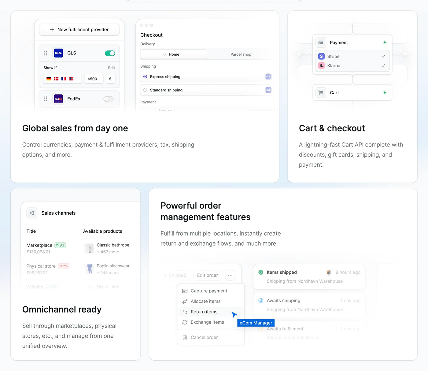
Bento Grid Example from Tailwind
Tailwind is amazing at finding the latest design trends and refining them to near perfection. Let's dive in to see what they decided to make:
In this presentation design, they use a rich border radius on the outer edges while keeping the radius value smaller inside the bento grid. One thing that stands out to me is the white space of the text. It feels fresh, and the design can breathe. The code-sharing block, getting affected by the border radius and stretching out all the way, is also a nice touch.

The more generic content also looks great. Bento Grids are really awesome!
Creating a Modern Bento Grid
Let's build a bento grid using modern CSS techniques. Note that this demo isn't very responsive. I made it to showcase the design on desktop monitors.

1. Define Your Grid Container with Named Areas
Using grid-template-comlumns, we can visually map out the basic grid layout
.grid-features {
  grid-column-gap: 2rem;
  grid-row-gap: 2rem;
  grid-template-rows: 1fr;
  grid-template-columns: 4fr 3fr 3fr;
  grid-auto-columns: 1fr;
  display: grid;
}
2. Assign Basic Grid Item with other Items
.bento-card {
  border-radius: 2.5rem;
  flex-direction: column;
  align-items: flex-start;
  min-height: 15rem;
  padding: 2rem;
  display: flex;
  position: relative;
  background-color: #fff;
  color: #060633;
  box-shadow: 0 20px 30px -10px rgb(16 16 39 / 7%);
  text-wrap: balance;
}
.bento-card-description {
  display: flex;
  flex-direction: column;
  gap: 1rem;
}
.bento-card h2 {
  font-weight: 700;
  font-size: 3.8rem;
  line-height: 0.9;
  color: #3a3e61;
}
.bento-card h3 {
  font-weight: 600;
  font-size: 2.6rem;
  color: #3a3e61;
}
.bento-card p {
  font-weight: 500;
  font-size: 1.2rem;
  line-height: 1.3;
}
This creates a default style for the items inside the grid. In the next step, we bend the grid items to span across one or two grid columns or rows.
3. Apply the Bento Style to Selected Grid Items
We use grid-area to extend the grid items to where we want them to expand:
.bento-card.cloud {
  grid-area: 1 / 1 / 3 / 2;
  padding: 3rem;
}
.bento-card.logo {
  grid-area: 1 / 2 / 2 / 4;
  background-image: linear-gradient(-225deg, #fffeff 0%, #d7fffe 100%);
}
.bento-card.logo h2 {
  color: #38a5a2;
}
.bento-card.inbox {
  background-image: linear-gradient(-225deg, #ffffff 0%, #dacceb 100%);
}
.bento-card.inbox h3 {
  color: #8b5cca;
}
.bento-card.device {
  background-image: url("https://emilandersson.com/storage/blog-thumbnails/01JP9N86ZWBRV57ZVZBSA243R9.jpg");
  background-size: 100%;
  background-repeat: no-repeat;
  background-position: center;
}
.bento-card.device-2 {
  background-image: url("https://emilandersson.com/storage/works/thumbnails/01JPXM5JG84REHYA3GQYGA3SSM.webp");
  background-size: 100%;
  background-repeat: no-repeat;
  background-position: center;
}
.bento-card.ai-gen {
  grid-area: 3 / 2 / 4 / 4;
}
.bento-card.ai-gen h2 {
  font-size: 4rem;
  text-wrap: balance;
}
4. Finnish things up by placing the Grid Layout inside a container
Just create a very simple flex container:
.container {
  display: flex;
  flex-direction: column;
  margin: 3rem auto;
  width: 100%;
  max-width: 1200px;
}
There we have it! A really nice looking Bento Grid. View the complete code for the Bento Grid at CodePen
Conclusion
Bento grids provide a modern solution for structured layouts that blend form and function. With other smart CSS techniques like grid-template-areas, aspect-ratio, and clamp(), you can create even more fluid, elegant designs that stand out. Mastering these methods will enhance your web design capabilities, making our layouts more adaptive and visually appealing.
From one's personal standpoint, I think Microsoft was the first pioneers into Bento Grids with their "boxy" Metro Grid design. Then Apple did Bento styled grids for their Mac promotion back in the days. So this is probably why the Bento Grid looks very refined today.